The website needed to catch up with the business.
The Barbers Lounge MK did not need a website to convince people that it was capable of delivering a good haircut. Its customers had already done a pretty good job of that. With more than 200 five-star Google reviews, the business had built the kind of reputation most local businesses would love to have.
The opportunity was making sure the digital experience lived up to it. When somebody discovered The Barbers Lounge through Google, a recommendation or social media, the website needed to reinforce everything people were already saying about the business rather than becoming the weakest part of the journey.
That changed the nature of the project. We were not trying to manufacture a premium brand around an unknown business. We were taking something that already worked extremely well in the real world and creating a digital presence capable of representing it properly.
The result needed to feel confident without being overdesigned, personal without becoming informal and polished without losing the character of an independent barber shop.
More than a haircut.
There are thousands of websites that can tell somebody where to get their hair cut. The more interesting question was why customers repeatedly choose The Barbers Lounge MK.
The answer is not simply technical ability. A successful barber builds relationships with customers over time. People return because they trust the person cutting their hair, enjoy the environment and know what sort of experience they are going to get when they walk through the door.
That gave us the idea underpinning the site:
It’s more than a haircut.
That thought allowed us to position The Barbers Lounge around the experience rather than reducing the business to a list of services and prices. The haircut remains the product, of course, but the relationship between the barber, customer and space is what makes the business distinctive.
The website therefore needed to show the people and atmosphere behind the service. Real photography became central to the design, giving visitors a genuine sense of the environment instead of relying on generic barber imagery that could belong to virtually any shop in the country.
Letting the photography do its job.
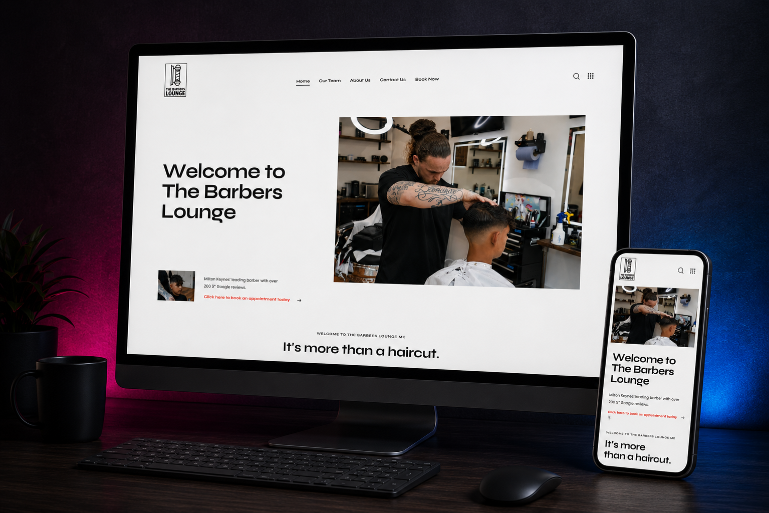
The visual direction for The Barbers Lounge is deliberately restrained. The website uses an almost entirely monochrome foundation, substantial white space, confident black typography and carefully placed red accents around the actions that matter.
That restraint creates room for the photography.
Rather than surrounding the images with unnecessary graphics, effects or decorative elements, we allowed them to become the visual personality of the site. Visitors see the barber working, the customers, the shop and the experience they can actually expect when they arrive.
This creates an important contrast. The interface itself feels clean and controlled while the photography introduces warmth, character and personality. Together, they give the website a premium feel without turning an independent barber into something resembling a luxury fashion label.
Good design does not always require adding more. Sometimes the strongest decision is knowing what to leave alone.
Putting the barber at the centre of the business.
For a service such as barbering, the person delivering it matters enormously. Customers are not simply choosing a business name or a price point. They are choosing somebody they are going to trust with how they look.
That made the team an important part of the website rather than an afterthought.
The site gives customers an opportunity to understand who they are booking with and puts a face to the experience before they arrive. That becomes particularly valuable for new customers who have found The Barbers Lounge through search but have never visited before.
It also makes the website feel considerably more human. The strongest local service businesses are built around people, yet their websites often hide those people behind generic stock photography and corporate copy. We wanted to do the opposite.
The photography, team content and tone of the website all reinforce the same idea: this is a real place, run by real people, with an established community of customers around it.
Reputation should be visible.
More than 200 five-star Google reviews is not a throwaway statistic. It is one of the strongest pieces of evidence The Barbers Lounge has.
For a potential customer, particularly somebody choosing a new barber, reviews reduce uncertainty. They show that the experience being promised by the website is consistent with what existing customers have actually received.
We therefore brought that reputation into the main proposition rather than hiding it halfway down a page. Visitors can see immediately that they are looking at an established Milton Keynes barber with a significant body of positive customer feedback behind it.
That is considerably more persuasive than filling the homepage with unsupported claims about exceptional service or being the best barber in the area. The business does not need to tell people how good it is when hundreds of customers have already volunteered to do that.
Our job was simply to make that evidence difficult to miss.
Making booking the easiest part of the journey.
For The Barbers Lounge, the primary conversion is obvious: book an appointment.
That simplicity is useful, but it also means there is very little excuse for creating friction around it. Once somebody has decided they want an appointment, the website should get out of the way.
Booking therefore has a prominent position within the site architecture and appears naturally throughout the customer journey. It is available from the main navigation, reinforced through calls to action and supported by direct WhatsApp contact for customers who would rather start a conversation.
The important part is that the site does not make somebody repeatedly hunt for the same action. Whether they arrive knowing exactly what they want or spend time getting to know the business first, there is always a straightforward route towards making the appointment.
This is where design and commercial purpose need to work together. A beautiful barber website that makes booking unnecessarily difficult has failed at one of its most basic jobs.
Designing around local customer behaviour.
The Barbers Lounge is fundamentally a local business, which means the website has a very different job from a national ecommerce brand or a business selling complex professional services.
A large proportion of prospective customers are likely to arrive with fairly immediate intent. They may search for a barber in Milton Keynes, follow a recommendation, look up the business after seeing it locally or return because they need to make another appointment.
The site therefore needs to answer practical questions quickly. Who are you? What is the experience like? Can I trust you? Where are you? Who can I book with? How do I make an appointment?
We structured the experience around those decisions rather than filling the site with content for the sake of making it appear substantial. Pages have a purpose, navigation remains intentionally compact and the customer is never very far from the information required to take the next step.
That is particularly important for mobile visitors, where convenience becomes even more important.
Mobile is not the secondary experience.
For a barber, mobile traffic is not something to accommodate after the desktop site has been finished. It is likely to be one of the primary ways customers interact with the business.
Someone might decide they need a haircut while sitting on the sofa, walking through town, finishing work or looking at their increasingly questionable reflection in the mirror. They are unlikely to wait until they are sitting in front of a desktop computer before finding somewhere to book.
The mobile experience was therefore considered throughout the design. Navigation becomes simpler, photography remains impactful without overwhelming the screen and booking routes remain prominent and easy to use.
Content hierarchy matters even more at smaller sizes. The customer should be able to understand the business, see its reputation and move towards booking without wading through unnecessary sections or struggling with controls designed for a mouse.
Responsive design is not about making the desktop layout fit on a phone. It is about preserving the quality of the experience when the way somebody interacts with it changes completely.
Building local search into the foundations.
For a business like The Barbers Lounge, being visible in and around Milton Keynes is not a vanity metric. It puts the business in front of people at one of the most commercially useful points in the customer journey: when they are actively looking for somewhere to get their hair cut.
That makes local search particularly valuable. Somebody searching for a barber in Milton Keynes, comparing nearby options or looking for a specific barbering service is demonstrating considerably more intent than somebody who happens to scroll past an advert. The job was therefore not simply to build a better-looking website, but to give that existing demand somewhere stronger to land.
We built local relevance into the structure of the site rather than treating SEO as something to bolt on afterwards. Page hierarchy, headings, service language, internal structure and copy all help search engines understand what The Barbers Lounge does, where it operates and which searches the business should be relevant for.
Importantly, that does not mean repeating “barber Milton Keynes” until everybody involved loses the will to live. Good local SEO should make a website clearer. The language customers use when searching should sit naturally alongside useful information about the business, its services, its people and its location.
The Barbers Lounge also started with something many businesses spend years trying to build: genuine local authority. More than 200 five-star Google reviews provide a significant body of evidence around the business, while its established customer base and reputation reinforce the signals the website is trying to communicate.
The website gives those signals a stronger digital foundation. Search can bring somebody into the journey, the site can establish trust and explain the experience, and the booking route can turn that visibility into an appointment.
That is the bit that matters. Ranking is useful. Being found by somebody who is ready to become a customer is considerably more useful.
Keeping the experience deliberately simple.
One of the easiest ways to make a website feel more expensive is to add things to it. Animation, elaborate transitions, oversized menus, decorative elements and increasingly complicated interactions can all create the impression that more work has gone into the design.
That does not necessarily make the website better.
The Barbers Lounge did not need digital theatre. It needed confidence.
We kept the interface deliberately minimal so the hierarchy remains obvious and the business itself stays at the centre of the experience. Strong typography establishes the message, photography brings the personality, small red accents identify important actions and generous spacing prevents the pages from becoming cluttered.
That simplicity is not the absence of design. It is the result of making decisions about what deserves attention and removing the things that do not.
The finished website feels cleaner because it has less fighting for the customer’s attention.
Connecting the online experience with the one customers already love.
One of the biggest risks with redesigning the website of a successful local business is creating something that feels completely disconnected from the business customers already know.
The Barbers Lounge already had a personality. We did not need to invent another one.
Instead, the design was built around translating the physical experience into a digital one. Real photography shows the environment. The monochrome styling reflects the simplicity of the existing identity. The copy remains straightforward and conversational. The team is visible. Booking is easy.
There is no attempt to make the business sound larger, more corporate or fundamentally different from what it is.
That authenticity matters because the website is ultimately making a promise about what somebody will experience after they book. The closer the digital presentation is to the reality of the business, the more credible that promise becomes.
A website built to support repeat business as well as win new customers.
A local service website is not only an acquisition tool. Existing customers need it too.
For someone who already knows The Barbers Lounge, the priorities are likely to be different. They may simply want to book again, check something before an appointment or find contact information. They do not need to be resold the entire proposition every time they visit.
That is why the booking journey remains accessible without forcing returning customers through marketing content they have already seen.
At the same time, new visitors can explore further, understand the team, see the experience and establish the trust they need before making their first appointment.
The same website therefore serves two different stages of the customer relationship without needing two completely different experiences. That is a much more useful way of thinking about conversion for a business built on repeat customers.
Giving a strong local business a digital presence to match.
There is a recurring theme across many established independent businesses: the real-world reputation develops much faster than the digital presence.
Customers know the business is good. Word of mouth works. Reviews accumulate. People return. Meanwhile, the website gradually becomes less representative of what the business has become.
The Barbers Lounge MK was an opportunity to close that gap.
The finished website does not try to reinvent the business or create a complicated new proposition around it. Instead, it takes the strongest things already there, the reputation, the people, the customer experience and the quality of the work, and presents them with considerably more confidence.
That gives new customers a better first impression while making life easier for the people who already know exactly why they keep coming back.
What AMB360 delivered
Website strategy and information architecture
We built the site around the actual customer journey, creating straightforward routes through the homepage, team, business information, contact and booking without introducing unnecessary layers of navigation.
UX and visual design
A deliberately minimal visual system uses substantial white space, confident black typography, real photography and restrained red accents to create a premium identity while keeping the experience easy to navigate.
Responsive website development
The website was developed to retain its hierarchy and visual character across desktop, tablet and mobile, with particular attention given to the way customers are likely to discover and book a local barber from their phone.
Booking journey
Booking is treated as a primary action throughout the experience, with clear routes towards making an appointment and direct WhatsApp contact available for customers who prefer a more immediate conversation.
Photography-led experience
Real imagery from The Barbers Lounge gives the site its personality, allowing customers to see the people, environment and quality of the work rather than relying on generic stock photography.
Reputation positioning
The business’s 200-plus five-star Google reviews are brought into the proposition as genuine evidence of customer satisfaction rather than replacing them with unsupported marketing claims.
Local search strategy and SEO foundations
Local search was considered throughout the project rather than after the website had been built. Site structure, page hierarchy, headings, service language, internal linking and geographic relevance were developed to give The Barbers Lounge a stronger foundation for high-intent searches around barbering services in Milton Keynes, while keeping the copy natural and useful for the people actually reading it.
Bespoke WordPress development
The finished website provides The Barbers Lounge with a practical platform that can continue to evolve as the team, content and business develop.
The result
The Barbers Lounge MK now has a website that feels much closer to the standard of the business it represents. It is clean without feeling empty, premium without becoming pretentious and deliberately simple without feeling generic. Most importantly, it makes the things that already make the business successful much easier to see.
New customers can understand the proposition, see the environment, meet the people behind it, recognise the strength of the existing reputation and move directly towards an appointment. Returning customers can get back to the thing they actually came for without unnecessary friction.
The project also gives that reputation a stronger route into search. The business already had the reviews, customer loyalty and local credibility. The new site gives those signals a clearer structure around which organic visibility can continue to grow, connecting local discovery much more directly with trust and booking.
The strongest part of the project is that we did not need to invent a story for The Barbers Lounge. The story was already there in the people, the customer experience and hundreds of five-star reviews.
The website simply needed to do that reputation justice.