Brand consistency across every touchpoint
A strong brand doesn’t stop at a logo, a website or a set of colours. It needs to feel like the same business wherever a customer encounters it.
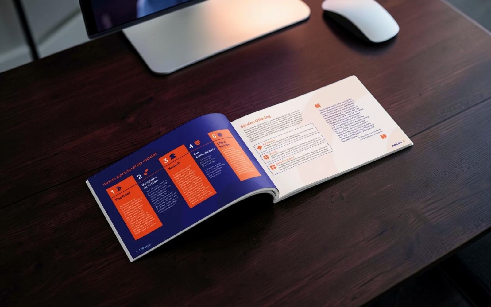
Our work with Nexus focused on taking an established visual identity and carrying it consistently across a range of printed marketing collateral, including brochures, sales materials and supporting brand assets.
The objective wasn’t to reinvent the brand. It was to make sure it was being used properly.
Building a consistent visual language
When businesses produce marketing materials over time, consistency can quickly disappear. Different layouts creep in, typography changes, colours drift and individual pieces of collateral start to feel disconnected from one another.
For Nexus, we developed a clear visual approach that could be applied across different formats while remaining unmistakably part of the same brand.
Typography, spacing, colour, imagery, graphic treatments and page structures were considered as part of one system rather than individual design decisions. That gave every piece its own purpose while ensuring it still belonged to the wider Nexus identity.
Brochures designed to communicate
Brochure design isn’t simply about making pages look good. There is usually a lot of information competing for attention, and the design has to give that information structure.
We created layouts that established a clear hierarchy between headlines, supporting messages, imagery, technical information and calls to action. Content could be scanned quickly without stripping away the detail needed by customers who wanted to read further.
The result was collateral that felt considered, professional and commercially useful rather than simply decorative.
On brand, every time
Consistency matters because every piece of marketing contributes to how a business is perceived.
A website can be beautifully designed, but if the brochure handed to a prospective customer looks like it belongs to another company, that consistency immediately disappears.
Our work for Nexus ensures the same visual standards carry through from digital channels into physical collateral. The colours feel right. The typography feels right. The imagery feels right. Most importantly, it feels like Nexus.
Design that strengthens the wider brand
Rather than treating each brochure or piece of collateral as a standalone project, we approached the work as part of the wider Nexus brand.
That creates something much more valuable than a collection of individual designs. It creates recognition.
Whether someone encounters Nexus through a brochure, a sales document, printed collateral or another marketing touchpoint, the experience remains coherent and recognisable.
Because good graphic design shouldn’t compete with the brand.
It should make the brand stronger.