More than vehicle transport
At first glance, Paul’s Auto Service is a vehicle transport business. Spend a little longer understanding the operation, though, and it becomes clear that simply describing it as vehicle transport leaves quite a lot out.
The business provides professional vehicle transport and automotive logistics across Ireland, working with private customers, motor traders, dealerships, businesses and motorsport enthusiasts. Alongside straightforward vehicle movements sit VRT and NCT transport, dealer stock transfers, secure vehicle storage, track-day logistics and a much broader Arrive & Drive proposition.
That breadth is a strength, but it also creates a challenge. Someone buying a car and needing it collected has a very different requirement from a dealership moving stock, while somebody arranging VRT or NCT transport is looking for something different again. A motorsport customer may want Paul’s to take care of virtually everything surrounding the vehicle so they can concentrate on the track day itself.
The new website therefore had to do considerably more than make the business look better. It needed to make Paul’s Auto Service easier to discover, easier to understand and easier to trust, while giving each type of customer a straightforward route from what they need to what they should do next.
Starting with what the customer actually needs
One of the easiest mistakes to make with a business website is to structure everything around the company itself. You end up with the familiar collection of About Us, Services, Gallery and Contact pages, technically covering everything while leaving the customer to work out where their particular requirement fits.
We approached Paul’s Auto Service from the opposite direction. Transport, VRT & NCT, Stock Transfer, Track Days, Storage and Arrive & Drive were given clear positions within the website because those are the reasons customers are actually likely to arrive there.
That makes the journey considerably simpler. Somebody who already knows what they need can go directly to the relevant service, while somebody still working out their options can understand the breadth of the business simply by moving through the site.
It also means the more specialist parts of Paul’s operation are no longer competing for attention beneath a generic services heading. Each has enough room to explain the problem it solves, the support available and what the customer can expect, making it easier for prospective customers to recognise when a service is relevant to them.
Selling the outcome, not simply the transport
Arrive & Drive is probably the clearest example of why that distinction matters. On paper, part of the service involves transporting a vehicle to a circuit, but that does not really explain what the customer is buying.
The wider proposition can include the logistics surrounding the vehicle, storage, wheels and tyres, fuelling and preparation. For the customer, the benefit is not simply that their car arrives at the circuit. It is that a substantial amount of the work surrounding the day can be taken off their hands, allowing them to concentrate on actually driving.
That thinking influenced the wider content across the site. Rather than presenting Paul’s as a list of individual capabilities, the website gives those capabilities context so customers can understand what they mean in practical terms.
It creates a much stronger proposition because the conversation moves away from what Paul’s can physically do and towards what those services make easier for the customer.
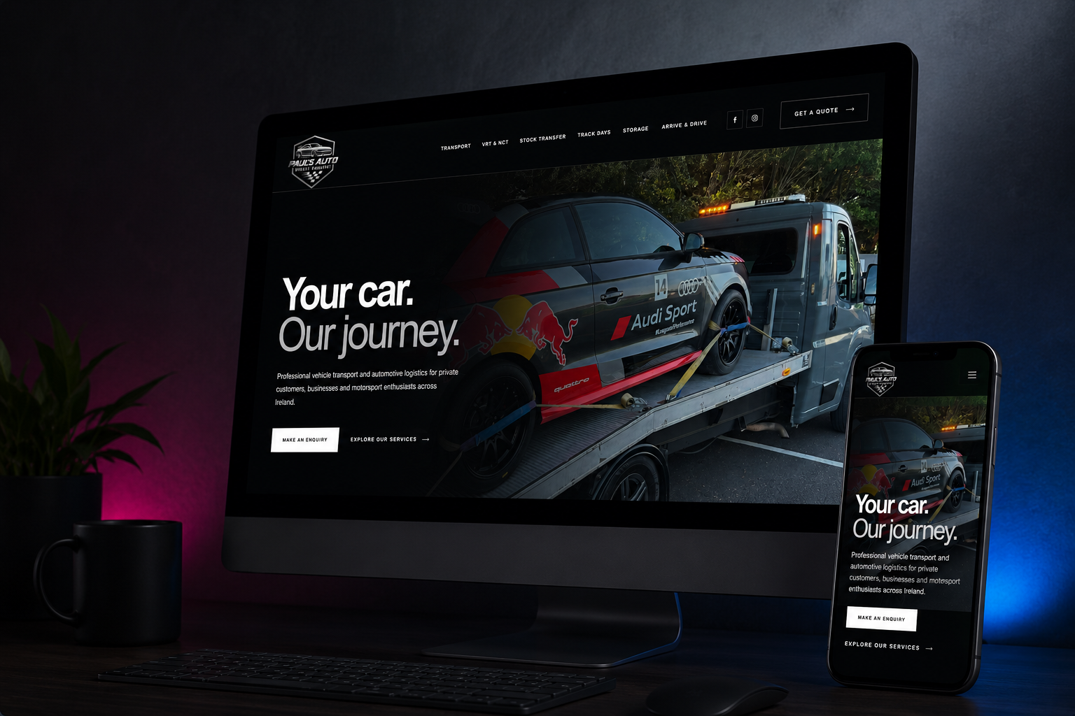
Your car. Our journey.
The visual direction needed to feel unmistakably automotive, but that did not mean filling every available space with carbon-fibre textures, enormous cars and animation for the sake of it. The vehicles and the operation already provide plenty of character, so the website did not need to manufacture any.
We built the visual language around a predominantly dark interface, strong photography, large typography and deliberately restrained detailing. That gives the vehicles room to provide the visual impact while the design concentrates on making the information easy to navigate and consume.
That thinking led to the central proposition, Your car. Our journey. It is simple enough to work immediately, but it also speaks to the responsibility involved in what Paul’s does and gives the wider service proposition somewhere to sit underneath it.
The result is a homepage that quickly feels like the right environment for the business without making customers work through the design to understand what is being offered. The visual identity establishes the character of Paul’s Auto Service, while the structure and content do the more important job of helping people decide whether the business can solve their particular problem.
Building confidence before asking for the enquiry
Vehicle transport involves an unusual level of trust because the customer is not handing over something disposable. The vehicle may be financially valuable, personally important or both, and the website has to recognise that before it can reasonably expect somebody to make an enquiry.
Simply describing the business as professional, reliable and experienced would not have been enough. Those are useful qualities, but they are also claims virtually any competitor can make, so we wanted the website to give customers reasons to reach those conclusions for themselves.
The copy explains the situations Paul’s handles, who the different services are designed for and the practical support available around them. The photography shows the operation rather than filling the site with generic automotive imagery, while the service structure demonstrates an understanding of the different requirements involved in moving, storing and managing vehicles.
Together, those details reduce uncertainty before the customer ever gets in touch. By the time somebody reaches an enquiry point, they should have a much clearer understanding of the business and, more importantly, considerably more confidence about trusting Paul’s with their vehicle.
Making the next step easier
A website does not generate more enquiries simply because every other section contains a button. Customers need enough information to decide that they are interested first, and then the route into a conversation needs to be obvious when they are ready to take it.
Throughout the Paul’s Auto Service website, enquiry opportunities sit at the points where somebody is likely to have enough information to use them. The quote route remains readily accessible, individual service journeys lead naturally towards contact and the mobile experience makes it straightforward to move from researching a service to starting a conversation.
That creates a much more natural customer journey. Rather than constantly interrupting people with calls to action, the website allows the service content to answer questions and build confidence before making the next step easy to find.
For Paul’s, that means the website can do more of the early work before an enquiry arrives. For the customer, it means less friction between wondering whether Paul’s can help and actually starting the conversation.
Helping the right customers find the right service
Search visibility was considered as part of the structure rather than something to bolt onto the website after it had been designed. That matters because the different services Paul’s offers are associated with different customer requirements and different types of search.
Vehicle transport has its own context, while VRT and NCT transportation, dealer stock transfer, vehicle storage, track-day logistics and Arrive & Drive all solve different problems. Giving those services their own substantial content creates clearer areas of relevance throughout the website.
For prospective customers, that increases the chance of arriving somewhere that directly addresses what they were looking for rather than landing on a generic page and having to search for the relevant information. For Paul’s, it creates a stronger foundation for building organic visibility around the individual areas of the business it wants customers to find.
The same decisions therefore improve both sides of the experience. Search engines receive clearer information about what Paul’s Auto Service does, while customers receive pages that are more closely aligned with the reason they searched in the first place.
A better experience on every screen
A responsive website should not simply be the desktop version squeezed into a narrower space. Customers behave differently on smaller screens, the available space changes dramatically and information that works comfortably on a large display can quickly become awkward when viewed on a phone.
Navigation, hierarchy, imagery, typography, long headings and calls to action were therefore considered throughout the build rather than adjusted at the end. On larger screens, the site has room to make strong use of the automotive photography and typography, while smaller screens become more direct without losing the same identity.
That matters because the customer should not have to think about the device they happen to be using. Whether they discover Paul’s from a desk, from their phone while buying a vehicle or while organising the logistics around a track day, the experience needs to remain straightforward.
Underneath that sit the less visible parts of the project, including semantic structure, responsive development, properly configured enquiry routes, performance considerations and technical SEO foundations. None of those things are particularly exciting on their own, but together they help ensure the website continues working properly once somebody stops admiring how it looks.
Giving Paul’s room to grow
The objective was not to create something that looked finished on launch day but immediately became restrictive afterwards. Paul’s Auto Service already serves several different audiences and has an offering capable of expanding, so the website needed to accommodate that without requiring a redesign every time the business wanted to introduce something new.
Services now have their own space, the content hierarchy is consistent and the visual system can accommodate additional pages without losing its identity. The underlying WordPress build also gives the business a practical platform that can continue developing rather than leaving Paul’s with a static collection of pages.
That gives the business considerably more freedom for what comes next. New services can be developed, existing areas can be expanded and further search opportunities can be targeted without having to dismantle the foundations every time the operation changes.
A good website should make growth easier rather than becoming another obstacle to it. Building that flexibility into the project from the beginning means Paul’s has somewhere for the digital side of the business to go as the operation develops.
From brief to launch in less than a day
There is another part of this project worth mentioning because Paul’s Auto Service went from brief to a completely new website in less than a day. The speed is impressive, but the more important part is what the business actually had at the end of that day.
Paul’s had a substantial new website covering its core services, with a bespoke visual direction, responsive development, detailed service content, clear enquiry journeys and the technical foundations required for what comes next. It was not a temporary landing page, a rushed template or something designed to be replaced once there was more time.
That turnaround was possible because strategy, structure, copy, design and development were treated as one connected process. Decisions about content could influence design immediately, development could respond to the customer journey as it evolved and there was no chain of separate departments waiting for one another before the next part could begin.
The customer outcome is therefore more useful than the turnaround statistic itself. In less than a day, Paul’s went from the original brief to having a digital platform capable of explaining a complex service offering, supporting customer enquiries and giving the business a stronger foundation for future growth.
What AMB360 delivered
The project began with website strategy and information architecture built around the reasons customers actually use Paul’s Auto Service. Clear routes were created for Transport, VRT & NCT, Stock Transfer, Track Days, Storage and Arrive & Drive, making it easier for different audiences to recognise where their requirement fits.
The UX and visual design created a distinctive automotive environment without sacrificing usability, while the copy and positioning concentrated on the substance of each service and the customer problem behind it. Rather than relying on generic automotive language, the website explains what Paul’s does, who the individual services are for and where the proposition extends beyond straightforward vehicle transportation.
Bespoke WordPress development gave us control over the layout, responsiveness, hierarchy and future development of the site rather than forcing the business into a predetermined template. Technical SEO foundations were considered throughout the structure and content, while the enquiry journey, contact functionality, responsive testing and deployment brought those individual elements together into one complete customer experience.
The individual deliverables matter, but their value comes from how they work together. Strategy makes the site easier to navigate, content makes the services easier to understand, design builds recognition and confidence, development makes the experience work properly and the enquiry journey gives interested customers somewhere obvious to go next.
The result
Paul’s Auto Service now has a website that better represents both the scale of the operation and the experience its customers are actually buying. It feels unmistakably automotive without becoming predictable, communicates a broad service offering without making it complicated and gives individual services enough room to be properly understood while keeping them connected to one wider proposition.
For prospective customers, the difference is clarity. It is easier to find the relevant service, easier to understand what Paul’s can take care of, easier to see the value beyond simply moving a vehicle and easier to build confidence in the business before making contact.
For Paul’s, the website now does considerably more of the work before that first conversation takes place. It explains the offer, answers some of the obvious questions, establishes credibility, creates clearer opportunities for search visibility and gives customers a straightforward route into an enquiry.
The objective was never simply to give Paul’s Auto Service a newer-looking website. It was to create a stronger digital representation of the business they had already built, and in doing so make it easier for the right customers to understand the value of Paul’s Auto Service and choose them when they need it.