Premium estate agency branding built for instant credibility.
AMB360 created a refined brand identity for Durrant & Co, giving a new estate agency the confidence, polish and consistency needed to launch with authority across signage, digital, print and client-facing materials.

The problem was not just visibility. It was trust.
In estate agency, first impressions carry commercial weight. A brand has to work before a conversation begins. It has to look credible on a property board, feel premium in a valuation pack and remain recognisable across digital touchpoints where potential clients are making quick decisions.
Durrant & Co needed an identity that could launch with confidence. The brief was not to create something loud for the sake of attention. It was to create a premium estate agency brand that felt established, dependable and commercially serious from day one.
AMB360 approached the project as a complete brand system rather than a standalone logo exercise. The identity needed to work across estate agency boards, digital adverts, social graphics, smaller printed items, brand lockups and future website use without losing the premium feel that made it distinctive.
Traditional confidence with a sharper modern edge.
The creative direction combined premium estate agency cues with a more contemporary execution, creating an identity that felt polished without becoming cold or generic.
Logo and lockup.
A refined identity system was developed around elegant typography, a premium colour palette and a distinctive ampersand treatment that could work across different formats.
Built for context.
The brand was designed with real-world estate agency use in mind, including boards, digital placements, client documents, promotional assets and small-format applications.
One visual system.
Rather than creating disconnected assets, the work gave Durrant & Co a coherent visual direction that could scale across launch activity and future marketing.
The identity in the places people actually see it.
The Durrant & Co brand was developed to work beyond a logo file. It had to look credible on the street, polished in print, consistent across client touchpoints and strong enough to support the business as it grows.
The foundation of the identity.
The identity was built around a premium typographic approach, combining traditional estate agency credibility with a more contemporary visual style. The result is a logo system that feels established, recognisable and flexible across every application.
Visibility where it matters most.
Property boards remain one of the most powerful marketing assets available to estate agents. The design was developed to maximise visibility, strengthen local brand recognition and communicate professionalism at a glance.
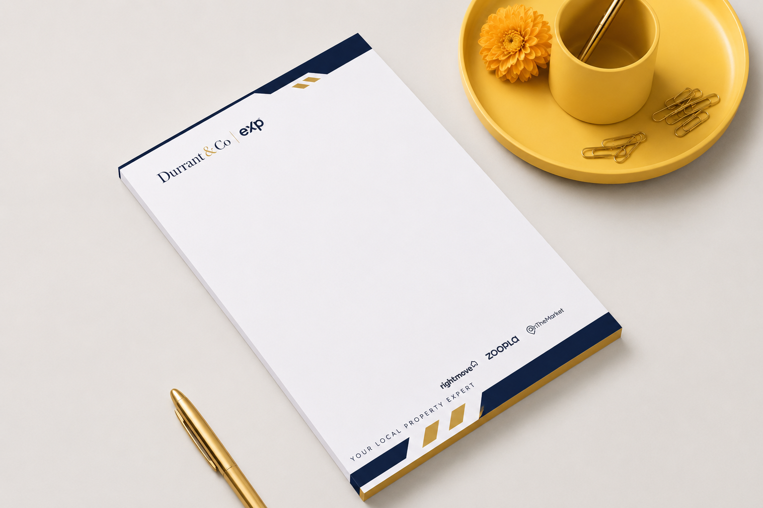
Professional from first contact.
Printed and digital stationery were designed to carry the same premium visual language, helping every interaction feel aligned with the quality and positioning of the business.
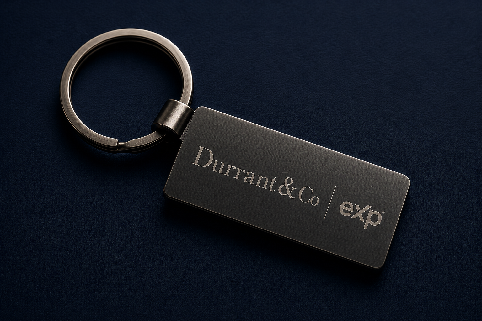
Every detail reinforces the brand.
Strong brands are built through consistency. From keyrings and promotional items through to client-facing materials, every touchpoint was considered as part of a wider brand experience.

Bringing the brand together.
Every element was designed to work as part of a connected system. Rather than creating individual assets in isolation, the project focused on building a brand identity capable of supporting growth across property marketing, digital channels and future business development.
A complete estate agency brand system, not just a logo.
The work gave Durrant & Co a premium visual identity that could be used confidently across launch materials, property marketing, client touchpoints and future digital activity.
Brand identity
Logo system
Board concepts
Brand applications
Digital direction
Need a brand that feels credible from the first impression?
Whether you are launching, repositioning or trying to sharpen your market presence, AMB360 can help shape the brand, website and marketing system around it.